top of page
Portfolio
My portfolio is a reflection of my passion for visual storytelling and thoughtful design. Each project represents a blend of creativity, strategy, and purpose—crafted to connect with audiences in meaningful ways. From branding and digital media to print and social campaigns, I focus on bringing ideas to life through cohesive visuals that inspire and communicate clearly. Every piece is a part of my creative journey, showcasing my growth as a designer and my commitment to creating work that both resonates and makes an impact.
 I designed this infographic to showcase Innovative Security Services’ core offerings in a clean, structured, and visually engaging way. My goal was to present complex information with clarity and balance, using consistent branding, modern typography, and impactful imagery. Every element—from color choice to layout—was created to reflect the company’s professionalism, reliability, and forward-thinking approach to security solutions. |  I designed this informational flyer to present Innovative Security Services’ mission and virtual security solutions with a modern, corporate aesthetic. The layout balances professionalism and clarity, using structured sections, brand-consistent colors, and strategic typography to highlight key services. Visual elements such as icons and imagery reinforce the company’s commitment to innovation, technology, and reliability, creating an impactful and trustworthy presentation for potential clients. |  I created the brand identity and style guide for Barefoot Boat Management, blending professionalism with the relaxed spirit of coastal living. The design features a nautical-inspired logo, soothing blue palette, and modern typography—crafted to reflect trust, clarity, and consistency across all brand materials. |  This logo concept was inspired by Norse heritage and warrior symbolism, designed to convey strength, resilience, and tradition. The progression showcases variations in linework, contrast, and color—moving from a minimal outline to a bold, full-color version. The final design combines clean vector precision with a powerful visual presence, making it adaptable for branding, merchandise, and digital use. |
|---|---|---|---|
 This piece combines delicate watercolor textures with modern typography to create an uplifting, faith-inspired design. Centered around Psalm 139:14, the composition celebrates beauty, growth, and individuality through vibrant florals, warm tones, and gentle natural elements. The artwork reflects my passion for blending meaningful messages with organic, nature-inspired visuals to evoke positivity and connection. |  I created this logo to represent a strong, reliable, and trustworthy fencing company. The design features bold geometric shapes inspired by fence structures, complemented by a patriotic color palette that conveys integrity and stability. The typography balances strength with professionalism, while the overall layout emphasizes durability and craftsmanship—core values of the brand. |  A festive design celebrating Puerto Rican culture and tradition, featuring the island’s flag and the Three Kings in silhouette. Created to capture the warmth, faith, and heritage of this beloved holiday through bold colors and expressive composition. |  A festive holiday-themed invitation design combining vibrant reds, gold accents, and seasonal elements like candy canes and evergreens. Created to evoke warmth and celebration, the layout balances cheerful typography with a clean, modern composition perfect for both print and digital sharing. |
 This promotional design was created as part of a holiday marketing campaign for the ION Pro Max solar battery. The layout blends festive elements with modern branding to capture attention and convey a message of practicality and celebration. Through bold typography, contrasting colors, and clean product presentation, the design highlights the special offer while maintaining a polished, professional appeal suited for both digital and print use. |  I created this festive promotional design to highlight a limited-time holiday offer for the ION Pro Max product. The layout combines bold typography, vibrant holiday colors, and decorative elements to capture attention and convey a cheerful, seasonal tone. The design balances energy and clarity, ensuring the product and pricing remain the main focus while maintaining a cohesive brand presentation. |  This seasonal advertisement was created for a Halloween-themed marketing campaign promoting the ION Pro Max battery system. The design blends playful holiday imagery with bold typography and vibrant color contrast to capture attention and maintain brand visibility. Featuring a humorous, eye-catching visual and clear pricing layout, the ad effectively communicates the promotion while keeping the tone festive and engaging for social media and digital marketing use. |  This bold and high-energy advertisement was created for SolarPro Caribbean’s Black Friday campaign. The design emphasizes urgency and excitement through dynamic typography, lightning graphics, and striking color contrasts. Featuring the ION Pro Max product as the focal point, the layout effectively blends visual impact with clear promotional messaging to capture attention and drive seasonal sales. |
 This design was created as a personal tribute to strength, courage, and survival. I wanted it to be bold, unapologetic, and empowering—a reminder that cancer doesn’t define a person’s story. |  This invitation was created for my nephew’s baby shower, designed to capture the love and excitement of welcoming him into our family. The soft watercolor stars, moon, and clouds bring a dreamy, heartfelt touch that reflects the joy and warmth of this special celebration. | 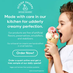 This social media advertisement was designed to promote Scoop Shoppe’s artisan ice creams with a clean, modern aesthetic and playful tone. The layout combines bright colors, friendly typography, and a high-quality lifestyle image to create an inviting, cheerful atmosphere. The design emphasizes the brand’s handcrafted quality and natural ingredients while maintaining visual balance and clear calls to action, ideal for online engagement and conversions. |  This mood board was created to establish the visual identity for Fresh Fare Farms, a brand focused on local, sustainable, and healthy food. The design highlights an earthy yet vibrant color palette inspired by fresh produce, paired with friendly typography that conveys approachability and trust. The imagery emphasizes community, freshness, and natural living—capturing the brand’s mission to connect people with wholesome, farm-to-table experiences. |
 This magazine ad promotes Fresh Fare Farms’ locally sourced, sustainable meal service. The vibrant imagery and organic design elements reflect freshness and community connection, while warm tones and clean typography create an inviting, trustworthy feel. A clear call-to-action encourages readers to support healthy living and give back through community-focused initiatives. |  This printed banner was designed to promote author Sheritta Bitikofer and her fantasy romance series. The design features a mystical forest backdrop, celestial accents, and a custom silhouette logo to capture the author’s themes of magic, courage, and transformation. Elegant typography and moon-phase motifs create an enchanting, atmospheric feel that aligns with her brand identity and appeals to readers of paranormal and romantic fiction. |  This logo represents my freelance graphic design brand, Adrianna Designs Art. I wanted it to reflect both my creative style and my personality—elegant, artistic, and nature-inspired. The soft lavender tones and floral details symbolize creativity and growth, while the gold circle adds a touch of sophistication and balance. This design embodies my passion for creating meaningful, visually cohesive designs that combine artistry with purpose. |  This logo represents my personal crochet brand, Wind-Up Stitchworx, which I created to share my love for handmade crafts. Crochet has always been a creative outlet and a source of relaxation for me, so I wanted the design to feel playful and comforting. The yarn ball, crochet hook, and wind-up key symbolize creativity in motion, while the purple color palette reflects calm and imagination—perfectly capturing the joy I find in creating each piece by hand. |
 This logo was created for a client who wanted a brand identity that felt elegant, artistic, and handcrafted. The design combines hand-drawn floral illustrations with soft watercolor textures to reflect the creativity and warmth behind Patti’s handmade baskets and painted creations. The muted pink palette and refined typography convey sophistication while maintaining a personal, artisanal touch that aligns perfectly with the brand’s aesthetic. |  This logo was designed for SolarPro Caribbean, a company specializing in sustainable solar energy solutions. The minimalist design uses clean lines and modern typography to reflect innovation and reliability. The subtle power-button icon integrated into the letter “O” symbolizes energy and technology, while the yellow accent adds a touch of brightness and optimism—capturing the essence of solar power and forward-thinking sustainability. | 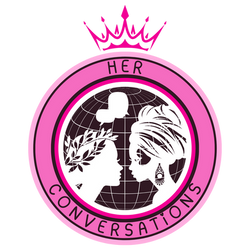 This logo was created for Her Conversations, a non-profit organization focused on empowering women through dialogue and community. The two women facing each other over a globe symbolize unity and strength, while the pink palette and crown represent compassion, leadership, and empowerment—capturing the organization’s mission to uplift and inspire women worldwide. |  This logo was created for AZ Coffee, a modern café brand focused on warmth and authenticity. Featuring a hand-drawn coffee bean and a subtle coffee stain, the design captures the cozy, handcrafted essence of a local café. The earthy tones and minimalist style reflect simplicity, quality, and a love for good coffee. |
 This flyer was designed to promote the Global Cleaning Water Initiative’s volunteer launch event. The layout combines strong typography with an inspiring image to highlight the organization’s mission of building sustainable clean water solutions. The design uses clear hierarchy, approachable language, and balanced color contrast to create an inviting and impactful call to action for community involvement. |  This six-part ad series was created for Focus 05 Downtown, a Soho-based restaurant. Each variation maintains consistent branding while exploring different color palettes, imagery, and layouts. Designed for subway train displays, the ads capture attention with bold visuals and approachable messaging that reflect the restaurant’s inviting, community-focused atmosphere. |  This six-part ad series was created for Focus 05 Downtown, a Soho-based restaurant. Each variation maintains consistent branding while exploring different color palettes, imagery, and layouts. Designed for subway train displays, the ads capture attention with bold visuals and approachable messaging that reflect the restaurant’s inviting, community-focused atmosphere. |  This six-part ad series was created for Focus 05 Downtown, a Soho-based restaurant. Each variation maintains consistent branding while exploring different color palettes, imagery, and layouts. Designed for subway train displays, the ads capture attention with bold visuals and approachable messaging that reflect the restaurant’s inviting, community-focused atmosphere. |
 This six-part ad series was created for Focus 05 Downtown, a Soho-based restaurant. Each variation maintains consistent branding while exploring different color palettes, imagery, and layouts. Designed for subway train displays, the ads capture attention with bold visuals and approachable messaging that reflect the restaurant’s inviting, community-focused atmosphere. |  This six-part ad series was created for Focus 05 Downtown, a Soho-based restaurant. Each variation maintains consistent branding while exploring different color palettes, imagery, and layouts. Designed for subway train displays, the ads capture attention with bold visuals and approachable messaging that reflect the restaurant’s inviting, community-focused atmosphere. |  This six-part ad series was created for Focus 05 Downtown, a Soho-based restaurant. Each variation maintains consistent branding while exploring different color palettes, imagery, and layouts. Designed for subway train displays, the ads capture attention with bold visuals and approachable messaging that reflect the restaurant’s inviting, community-focused atmosphere. |  This tri-fold brochure was designed to promote Piddle Paddle Tours, a coastal adventure company offering eco-friendly excursions. The layout balances vivid imagery with clear typography to capture the excitement of marine exploration while maintaining a professional, approachable tone. Each panel highlights different tour experiences and services, enhanced by oceanic colors and cohesive visual hierarchy to guide readers smoothly through the content. |
 This tri-fold brochure was designed to promote Piddle Paddle Tours, a coastal adventure company offering eco-friendly excursions. The layout balances vivid imagery with clear typography to capture the excitement of marine exploration while maintaining a professional, approachable tone. Each panel highlights different tour experiences and services, enhanced by oceanic colors and cohesive visual hierarchy to guide readers smoothly through the content. |  This magazine spread was inspired by the editorial design style of National Geographic. It combines a rich celestial photograph with a clean, balanced layout to evoke a sense of wonder and exploration. Careful attention was given to typography hierarchy, column structure, and image placement to create an engaging, professional composition that mirrors the visual storytelling and sophistication of scientific publications. |
bottom of page